

Hey friend!
We spring forward this week, and we don’t know about you, but that first stretch of longer evenings always changes our mood. The house feels different. The light hits differently. What felt cozy in January can suddenly feel a little heavy in March. Spring has a way of exposing what feels fresh and what feels tired, and right now, design is shifting in a big way. If you have been craving a reset, this is your sign.
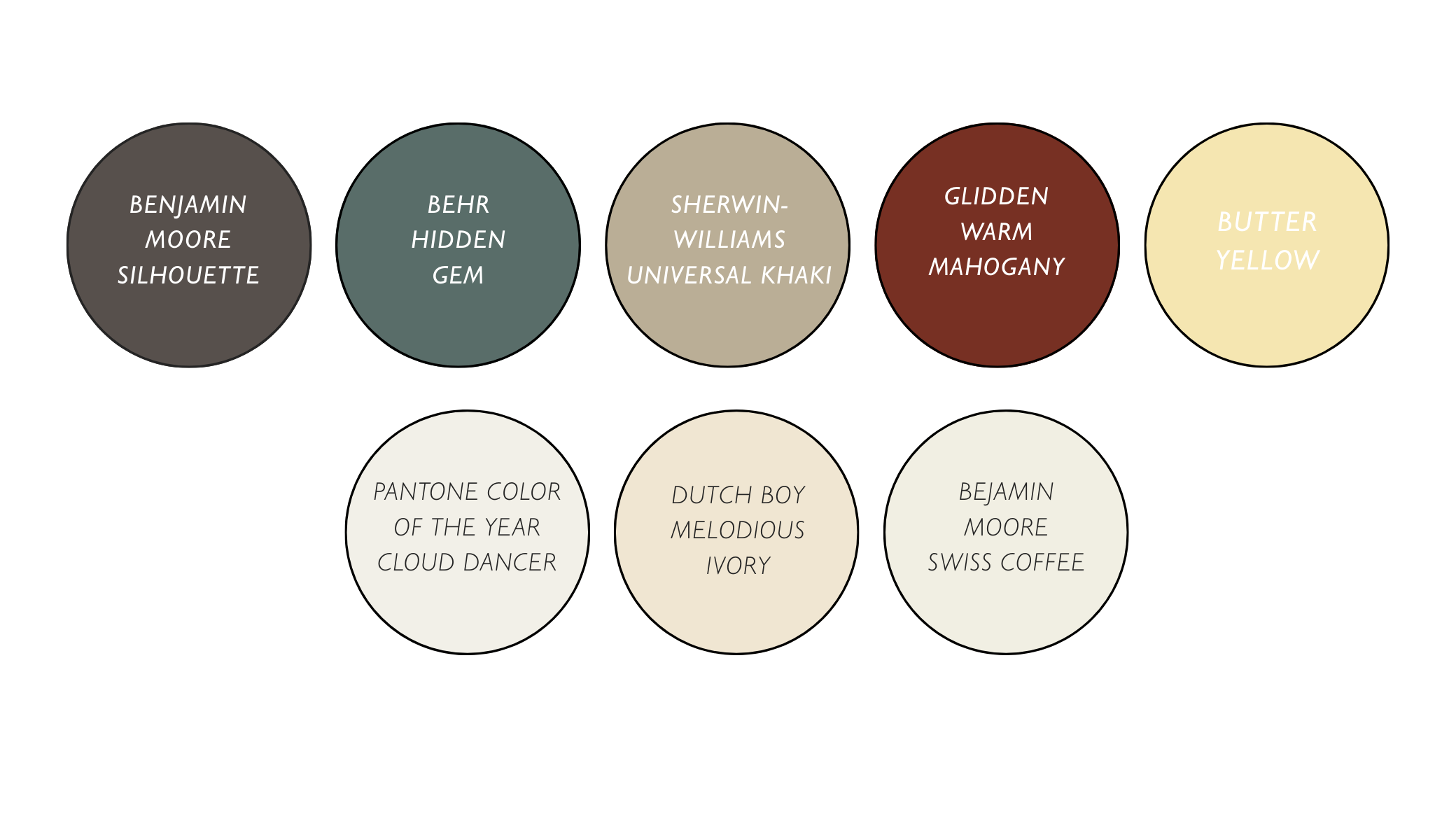
If 2025 was about dopamine decor, Spring 2026 is about the 'Emotional Cocoon.' The 'Sad Beige' era is over, replaced by rich, sun-drenched tones and complex creams that breathe life into a space. It’s a mix of 90s nostalgia and biophilic depth that feels both fresh and familiar. If you’re looking to refresh your walls this season, these are the eight colors you need to know:
Why these colors are "In"
The Return of Warmth: We are biologically wired to find comfort in earth tones. After a period of high global stress, consumers are gravitating toward "Mother Earth" colors (terracotta, sage, and sand) to create a sanctuary.
The "Anti-Digital" Movement: As AI and digital screens dominate our lives, we want our physical walls to feel tactile. These colors (especially the "dirty" whites and "smoky" greens) look better with natural textures like linen, wood, and stone.
The 90s Renaissance: The "Butter Yellow" and "Warm Mahogany" trends are direct nods to the optimistic, warm-toned interiors of the 1990s, updated for a modern, cleaner aesthetic.
The New Mood Of Home
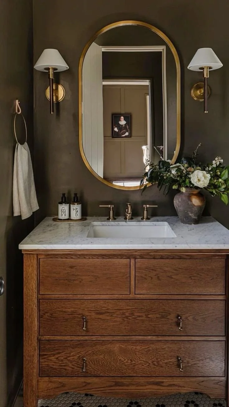
Moody Powder Room
Powder rooms are becoming the moment of the home. Instead of playing it safe, we’re seeing rich color, dramatic wallpaper, warm lighting, and bold mirrors take over these smaller spaces. A moody powder room feels intentional and layered, not dark and heavy. It creates contrast against lighter main living areas and instantly makes a home feel more custom. If you want to experiment with deeper tones like Silhouette or Warm Mahogany, this is the perfect place to do it.
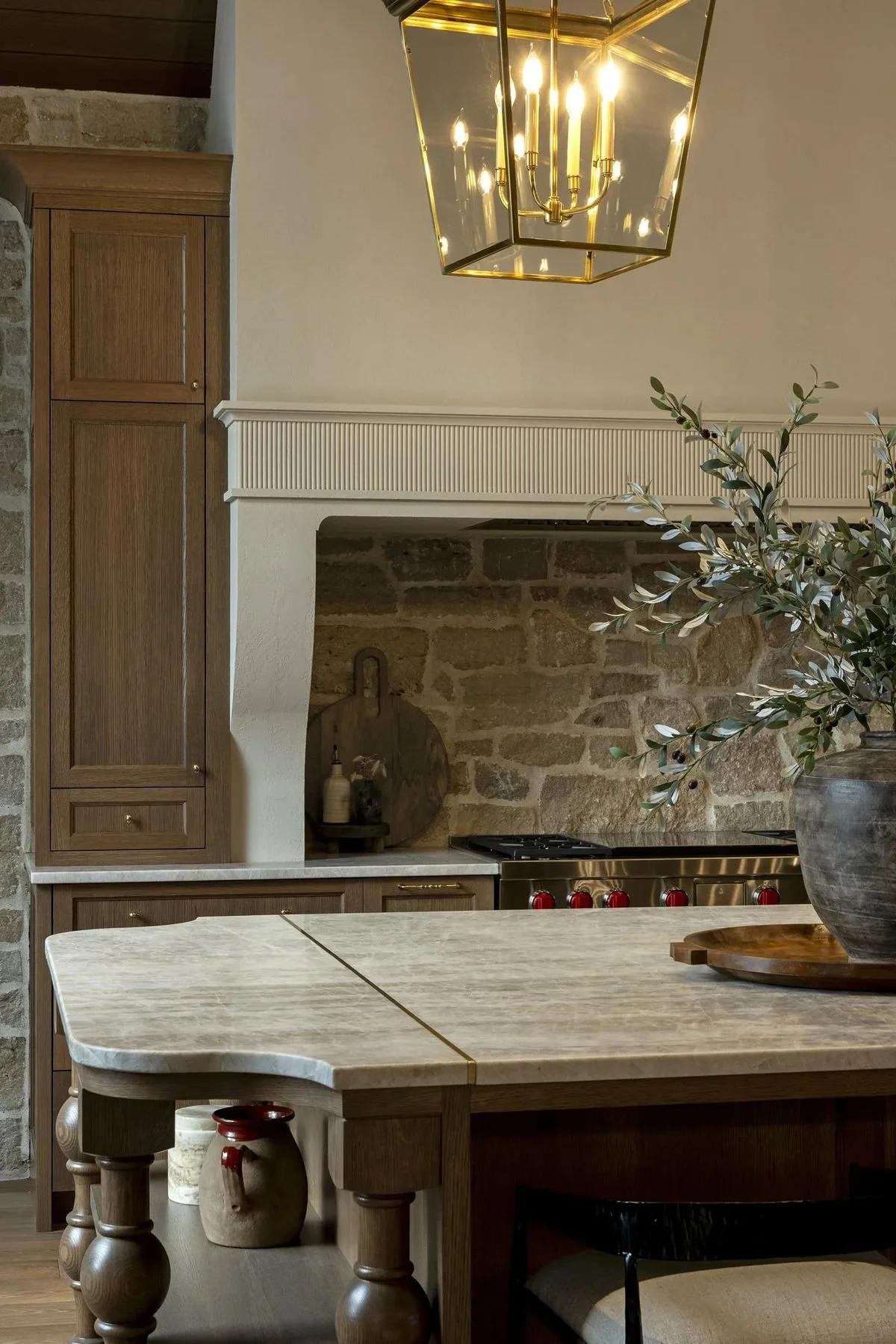
Soft European Kitchen Details
The all-white, ultra-sterile kitchen is slowly fading. In its place, we’re seeing softer, more European-inspired details. Think warm cabinetry, plaster range hoods, textured backsplashes, and natural stone with movement. These kitchens feel lived in and timeless rather than trendy. Universal Khaki, Swiss Coffee, and warm ivories create that understated luxury look that feels elevated but still inviting. It’s less showroom and more soul.
Update My Space for 2026
“Act as a high-end interior designer who specializes in 2026 design trends. Current trends include warm neutrals instead of cool gray, layered lighting instead of harsh overhead lights, moody accent spaces, soft European kitchen details, natural textures, and oversized art instead of gallery walls.
Based on these trends, create a personalized refresh plan for my [living room, bedroom, kitchen, powder room]. My space currently looks like this: [brief description].
Give me:
One paint color suggestion
Lighting improvements
Scale adjustments for rugs, art, and curtains
One bold focal point idea
A simple shopping list I could follow
Keep the recommendations realistic and budget-conscious.”
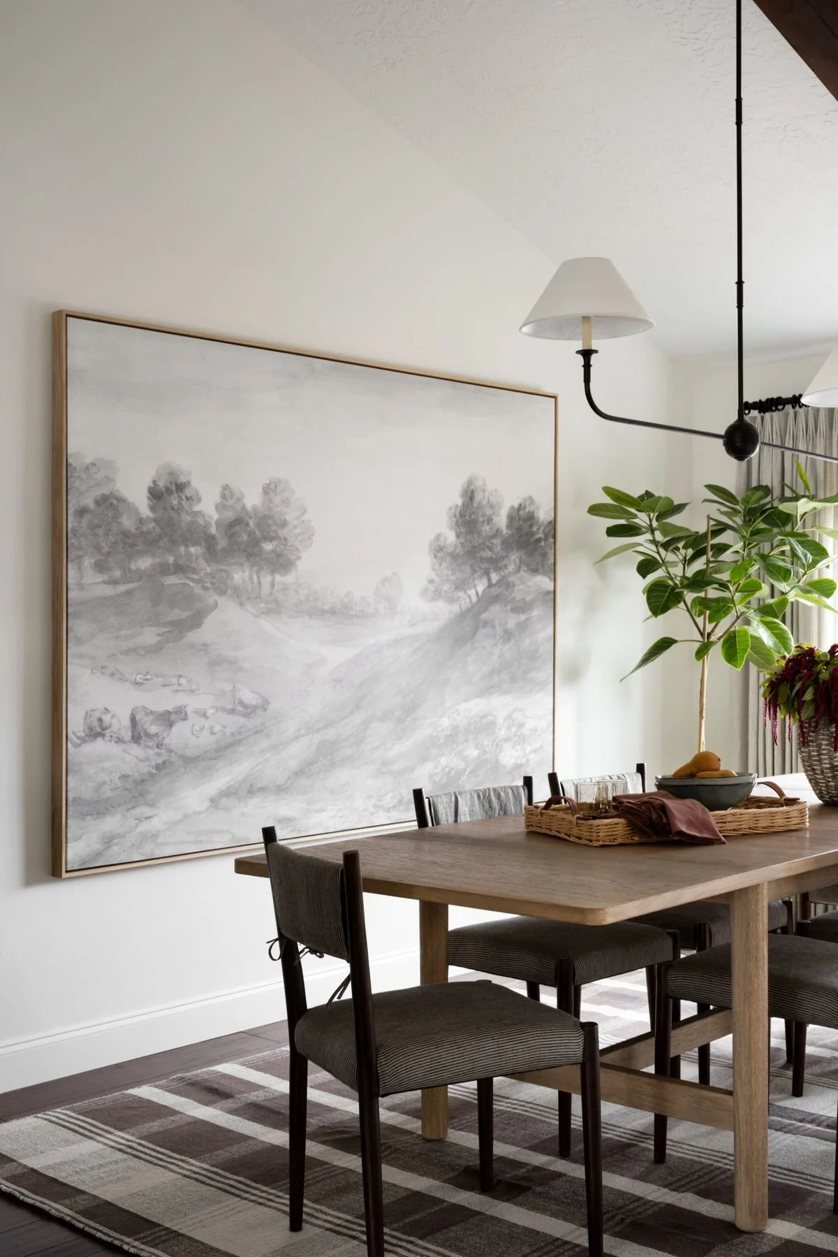
Large Scale Art Over Gallery Walls
Gallery walls had their moment, but 2026 is leaning toward bigger impact with fewer pieces. One oversized piece of art above a sofa or dining table feels confident and intentional. It creates a focal point, grounds the space, and eliminates visual clutter. Larger scale art also photographs beautifully and elevates a room instantly. The key is choosing something meaningful or textural rather than perfectly coordinated. Collected always feels more sophisticated than curated.
Design Mistakes We See All the Time
Now that the light is sticking around longer, it has a way of revealing everything. Sometimes it is not about needing a full redesign. It is just a few small adjustments that make a space feel more intentional.
Curtains that are too short: Curtains should kiss the floor and be hung higher and wider than the window frame. It makes ceilings feel taller and the room feel finished.
Rugs that are too small: If the rug only fits under the coffee table, it is too small. At minimum, the front legs of your furniture should sit on the rug to anchor the space.
Only using overhead lighting: One bright ceiling fixture can flatten a room instantly. Layer in lamps and use warm bulbs to create depth and softness.
Furniture pushed against every wall: Pulling pieces a few inches off the wall can actually make a room feel larger and more thoughtfully arranged.
Too many small decor pieces: Several tiny frames and accessories create visual clutter. Fewer, larger pieces feel calmer and more elevated.
Matching everything exactly: Homes feel more sophisticated when materials and finishes are layered rather than perfectly coordinated.
None of these require a renovation. Just a little awareness and intention.
Your AI Corner:
We put together three prompts this week that tie directly into everything we covered above. Whether you're brand new to AI tools or already using them regularly, just copy any of these prompts, paste them into ChatGPT, Google Gemini, Claude, or any AI assistant, fill in your personal details, and hit send. The more specific you are, the better your results will be.
Show Me this room in a 2026 paint color
“I am uploading a photo of my [room type]. Based on 2026 design trends that favor warm neutrals, earthy greens, and moody accent colors instead of cool gray, show me what this room would look like painted in:
• Benjamin Moore Swiss Coffee
• Sherwin Williams Accessible Beige
• A deep moody charcoal
• A soft muted green
Describe how each color would change the feeling of the space. Explain how natural light would interact with it during the day and evening. Tell me which option feels most elevated and why.”
As always, we are here for all of your real estate needs!
With Gratitude,
The SB Realty Team